Free Website Grant

Our Expertise

Logo Styles We Design

Every logo we design falls into one of five foundational styles. Choosing the right format up front shapes how your brand shows up on a business card, an app icon, a storefront, and everywhere in between.

01

Wordmarks

The company name, drawn with intent.

A wordmark is the full business name set in a custom or highly refined typeface. It's the most direct way to build brand recognition — the name IS the logo. Done well, the letterforms themselves carry the personality of the brand.

Best fit

Brands with a short, distinctive name that want maximum name recognition — think Google, Coca-Cola, Skycrest Creative.

Well-known examples

Google · Coca-Cola · Visa · FedEx · Sony

Google logo — real-world wordmarks example

Real-world example

Google

How we handle it: Best when the name is 1–3 words. Longer names shrink poorly on business cards, favicons, and mobile headers, so we typically pair long-name wordmarks with a companion submark.
02

Lettermarks

Initials or monograms carrying the whole identity.

A lettermark uses one to four initials of the brand name as the logo. It's the go-to when a full name is long, hard to pronounce, or already widely abbreviated in the market — the initials become the shorthand everyone remembers.

Best fit

Multi-word brand names, professional services, and legacy institutions where an abbreviation already feels natural.

Well-known examples

IBM · HBO · NASA · HP · CNN

IBM logo — real-world lettermarks example

Real-world example

IBM

How we handle it: Because it strips the name to a few letters, a lettermark leans hard on typography and proportion. We treat it as a custom-drawn mark, not a font choice.
03

Brand Marks

A pure symbol that stands in for the brand.

Also called a pictorial mark, a brand mark is a symbol or icon that represents the company without spelling out the name. It's the hardest logo style to earn — the symbol has to become synonymous with the brand through consistent use over time.

Best fit

Established brands, product-led companies, and businesses planning to grow globally where a language-neutral symbol travels well.

Well-known examples

Apple · Nike swoosh · Twitter bird · Target · Shell

Nike logo — real-world brand marks example

Real-world example

Nike

How we handle it: Usually launched alongside a wordmark and only used solo once brand recognition catches up. We deliver both variants so you can transition over time.
04

Combination Marks

A symbol and the name, working as one system.

A combination mark pairs a symbol with the brand name in a locked, considered layout. It's the most versatile logo format — you get instant recognition from the wordmark and long-term equity in the symbol, and you can separate them for tight spaces.

Best fit

New brands, growing companies, and any business that wants both name recognition AND a distinct icon it can eventually use on its own.

Well-known examples

Adidas · Lacoste · Doritos · Burger King · Skycrest Creative

Puma logo — real-world combination marks example

Real-world example

Puma

How we handle it: We design the symbol and the wordmark to hold up individually so they can flex apart — the icon works as a favicon or app tile, the wordmark works in a footer, and together they carry the primary brand.
05

Emblems

Type and symbol fused into a single crest.

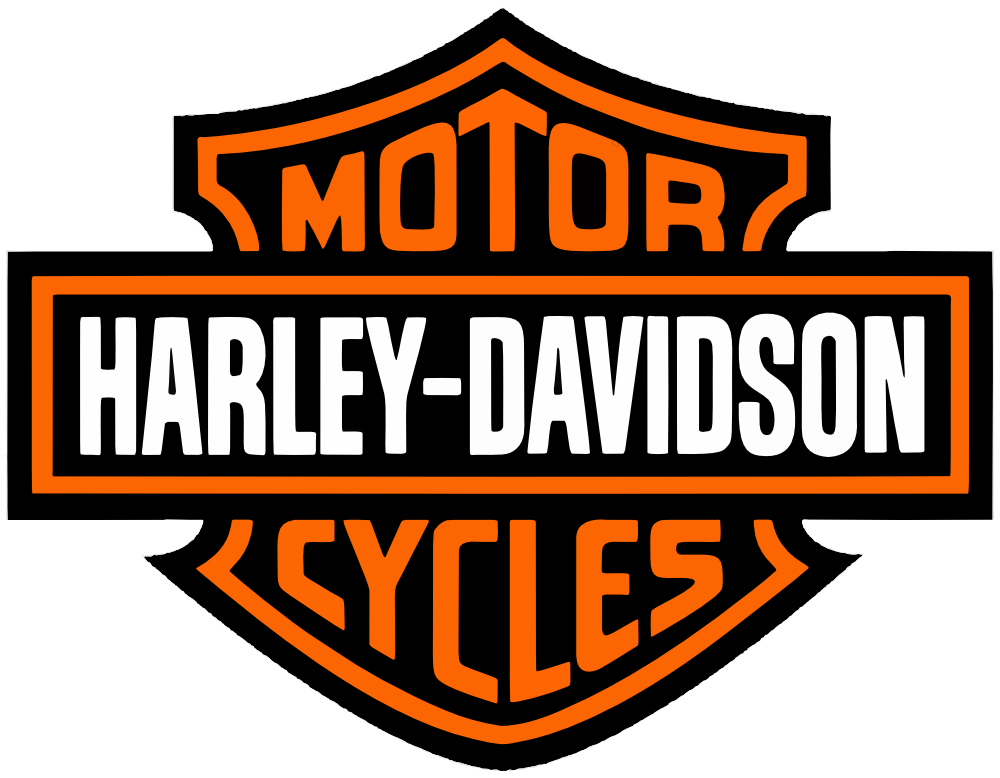
An emblem places the brand name inside a shape — a badge, crest, seal, or shield. It signals heritage, craft, and authority. Emblems photograph beautifully on merchandise, packaging, and signage where a single unified shape reads instantly.

Best fit

Craft brands, hospitality, sports, education, food and beverage, and any category where heritage or craftsmanship is part of the story.

Well-known examples

Starbucks · Harley-Davidson · BMW · NFL teams · Warner Bros.

Harley-Davidson logo — real-world emblems example

Real-world example

Harley-Davidson

How we handle it: Because the type and symbol are locked together, emblems can be harder to scale small — we build simplified variants for favicons and app icons so the mark stays legible everywhere.

Not sure which style fits best?

We start every branding project with a short discovery call to understand your audience, competitors, and how the mark will be used day to day. From there we recommend the format and present a direction — no template packs, no generic options.